
Date: 2023 - 2024
Role: Director of Design
Role: Director of Design
Executive Summary
Problem: Our existing design system was geared towards consumer-centric apps and failed to support complex B2B datasets. Users struggled to manage data grids exceeding 100,000 rows due to hidden UX affordances, inefficient boolean logic, and rigid view customization.
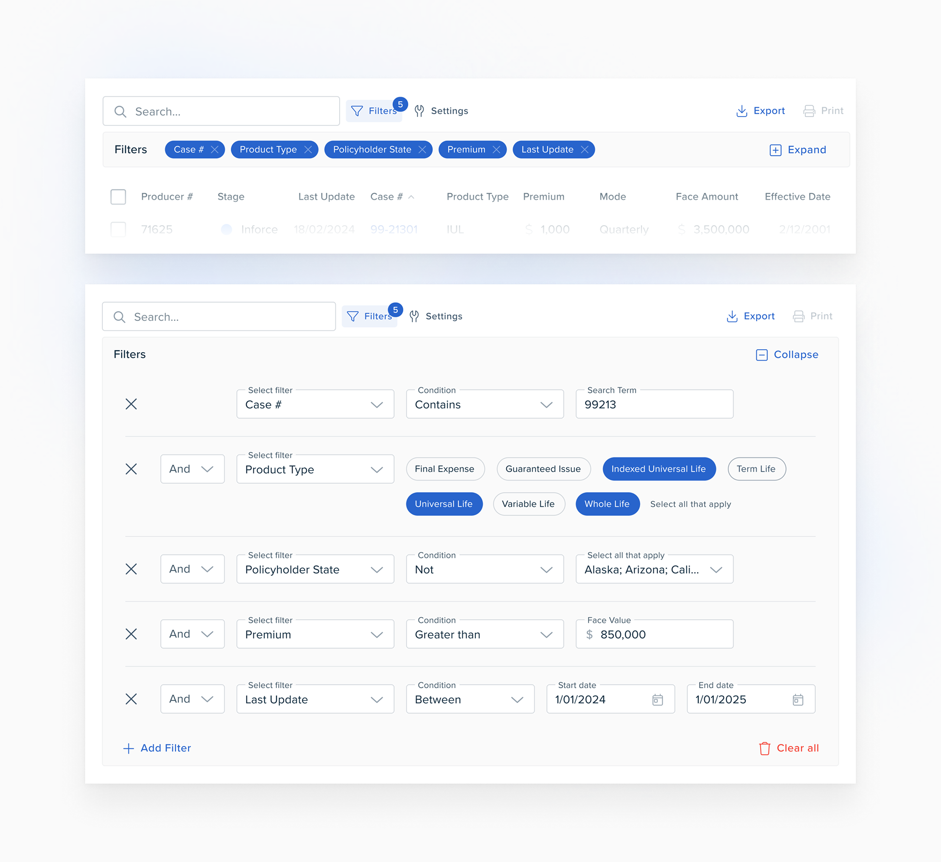
Action: I led the design of a new, standardized data grid filter and view module. We bypassed the limitations of "out-of-the-box" solutions by splitting filtering and settings into distinct, high-visibility features and expanding the logic system to handle complex categorical data.
Action: I led the design of a new, standardized data grid filter and view module. We bypassed the limitations of "out-of-the-box" solutions by splitting filtering and settings into distinct, high-visibility features and expanding the logic system to handle complex categorical data.
Results
• Scalability: Enabled complex boolean search queries across 100k+ rows and 20+ columns.
• Standardization: The module became the official UI standard for all data grid designs across the company's product suite.
• Efficiency: Improved table functions discovery by moving hidden column-level actions to a centralized global table control.
• Standardization: The module became the official UI standard for all data grid designs across the company's product suite.
• Efficiency: Improved table functions discovery by moving hidden column-level actions to a centralized global table control.
Context & Strategic Objective
The core issue was a "consumer-centric" design system being forced into a "B2B" environment. The default MUI X Data Grid required users to perform repetitive actions for simple filters and provided no clear visual affordance for customization.
Strategic Mandate
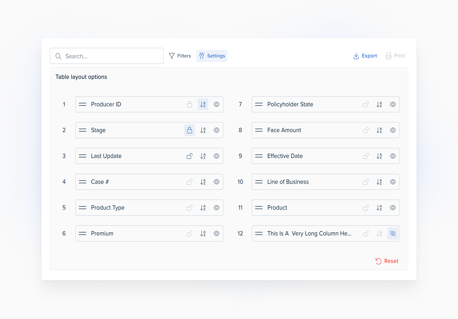
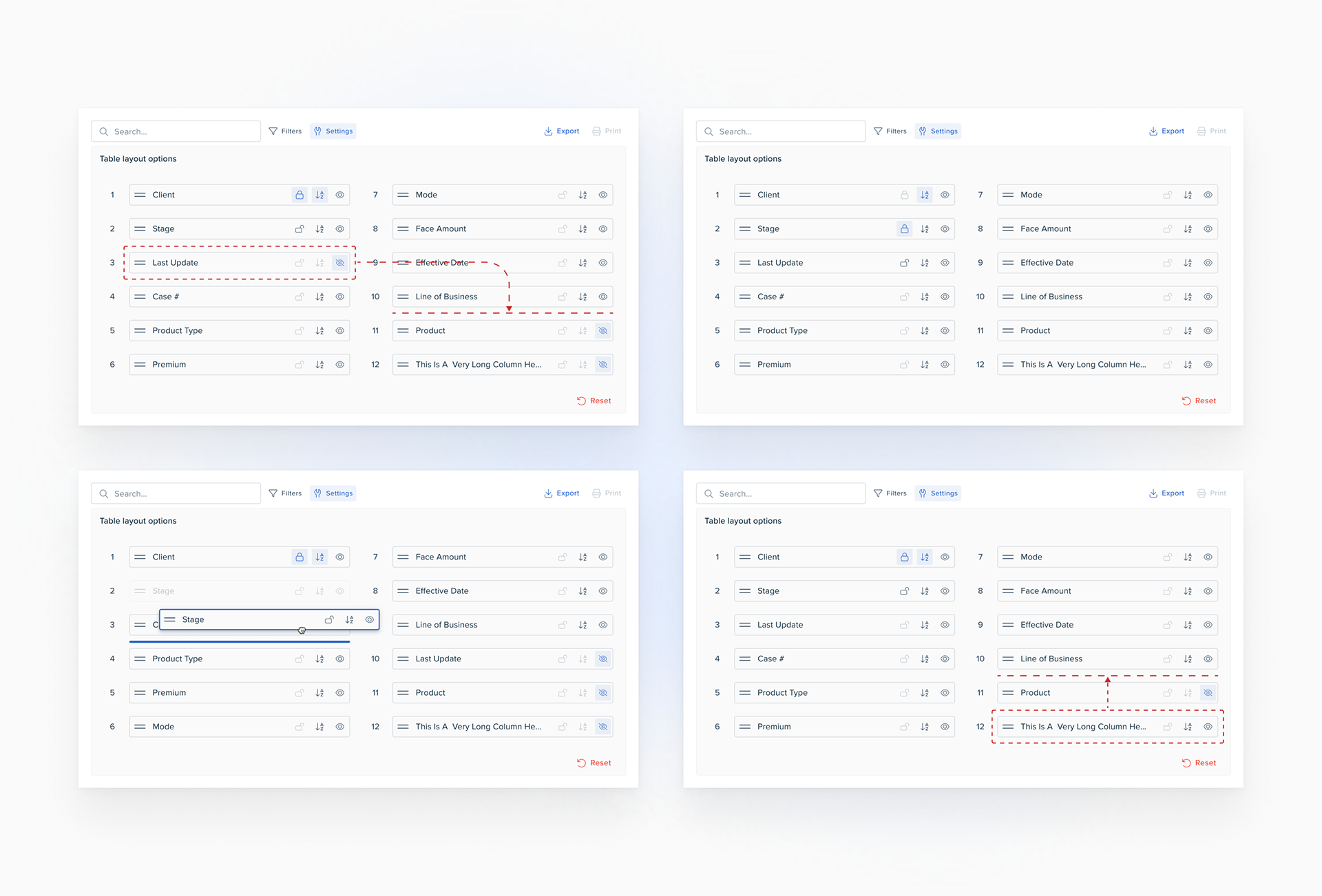
1. Centralize Control: Move table customization from individual headers to a permanent, global UI affordance.
2. Advanced Logic: Create "intra-condition" boolean operators to allow sophisticated filtering of categorical data (e.g., "and & not" logic).
3. View Persistence: Enable users to "freeze" columns and customize layouts without scrolling, solving for density and screen real estate.
4. User Empowerment: Enable “Home Office Users” (an admin like user persona in the Life & Annuity industry) to efficiently and quickly create and access data subsets in our LifetimeAGENT product.
Solution Architecture
I directed the team to move away from "hover-based" interactions toward a more robust, situational UI/UX framework.
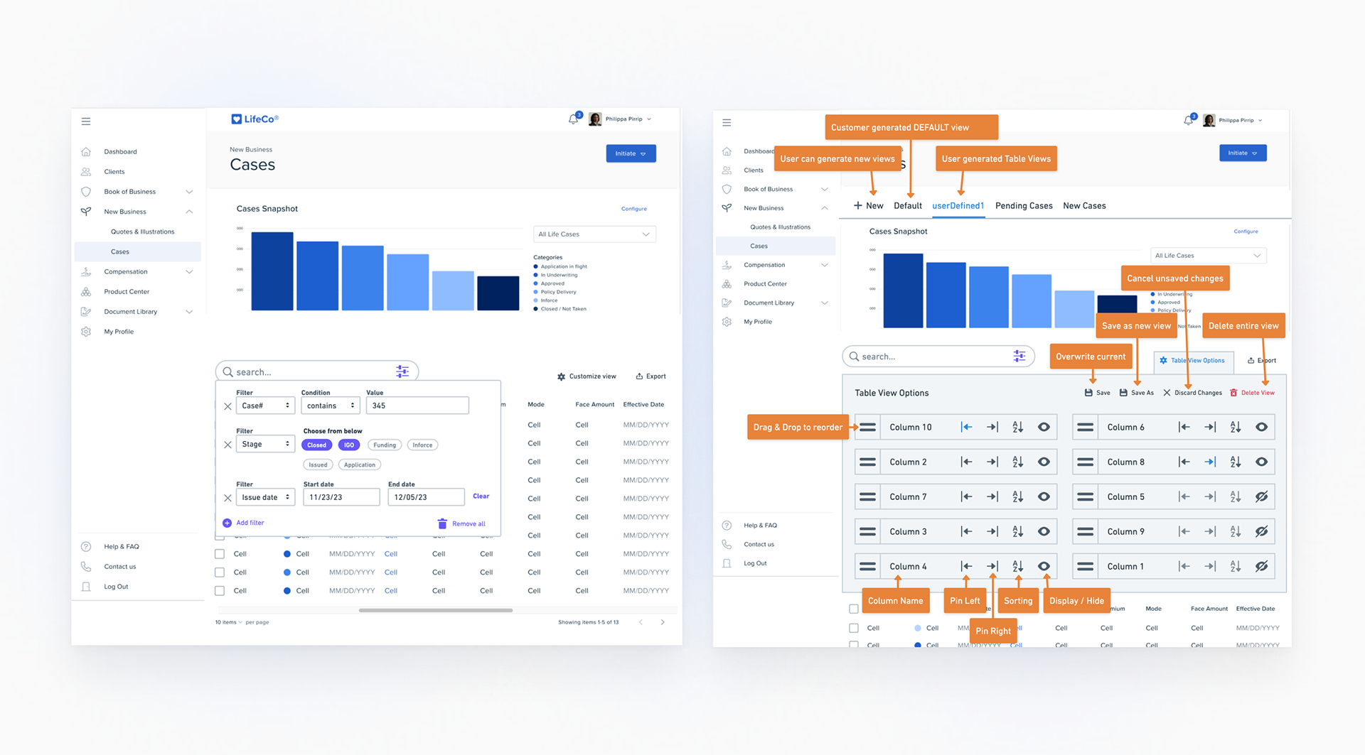
Feature Splitting: We separated "Filters" from "Settings" to reduce cognitive load, housing them in a standardized accordion UI above the table.
Input Optimization: We implemented a tiered input strategy: chips for small data sets, multi-select for large sets, and ranges for monetary/date values.
Density vs. Clarity: In the "Settings" panel, we used standardized icons for column freezing and visibility to maximize the space available for actual data labels.
Integration & Adaptation: Once Design, Product Management and Engineering were in agreement we canonized our custom created components in our design system, after which Engineering added the feature to all data grids in LifetimeAGENT.
The Messy Middle
Strategic design requires knowing what to cut to ensure delivery.
Strategic Trade-off: During development, we made the decision to descope "Data Grid Profiles" (the ability to save/load custom data grid views). While valuable, we prioritized getting the foundational filtering logic and UI components into the design system first. We intentionally designed the architecture to be "profile-ready" so the feature could be added later without a total refactor.
UI Friction: The "Settings" panel proved difficult to design. We initially explored advanced content sorting but realized it would clutter the UI and compete with column labels. We scrapped the option to freeze a column on the left-side entirely, after user research suggested it wasn't valued by users. I made the call to keep Settings simple and move complex logic entirely into the Filter module.
Quantitative & Qualitative Impact
The success of this initiative was measured by its immediate adoption as a global component.
Organizational Adoption: 100% of new and existing data-heavy table components now utilize this standardized UI/UX module.
Logic Expansion: Users can now manipulate categorical data entries using a single filter which previously required 1+ separate boolean steps (1 filter per category).
Improved QA: Canonizing these functions into the design system library reduced the volume of "custom table" defects reported by Engineering.
Improved Time-To-Task: The filter and settings UI/UX redesign removed the friction associated with creating fine grain data subsets in datasets of 100K+ rows.
Retrospective & Next Horizon
This project reinforced the need for B2B-specific patterns that prioritize high-density utility over consumer "simplicity."
Key Learnings: We used MUI as our jumping off point in creating our proprietary sureUI design system. While doing so provided us a great head start, it requires a Director-level eye to spot where the framework's "consumer" DNA fails an "enterprise" user.
Next Horizon: The next phase is to re-introduce the “Data Grid Profiles”. Now that the UI components are stable, we can layer on the saved-view functionality to help power users access their most frequently used data subsets and table views with one click.